Leaderboard


Popular Content
Showing content with the highest reputation on 10/31/2017 in all areas
-
3 points
-
2 points
-
I like both the logo and font, & think the younger generation will really like it. May seem trivial, but these sort of things factor into recruiting. Athletes want to win obviously, but they also appreciate a university that's not stuck in the 80s or 90s. I have a son on the baseball team, and he really like the new logo, etc.1 point
-
TheEagleman is very positive about the changes....the new bird is a huge upgrade over Foghorn Leghorn....now I have to get a new winter coat....my wife bought me one for Christmas last year and it has Eli on it....ugh!....1 point
-
One thing is for sure, we will experience "bumps" along the way. Hopefully last year represented the bottom of the barrel. It will take time to rebuild the program. Have patience, I believe this staff will turn the program around.1 point
-
Wichita is a legit National Championship contender this year. They are loaded even missing a couple of guys. We have some serious work to do to play these guys close. Luckily they could end up being the best team we see all season. Top 3 at a minimum. Hopefully the guys take knowledge out of the scrimmage instead of lost confidence.1 point
-
Looks much better than the jumbo-tron image above. Big improvement! I refused to buy anything with Eli on it in the past. I would buy this new logo. http://static.psbin.com/o/0/9su00vjtyk2bm1/Shattered-Logo-NewLogo.gif1 point
-
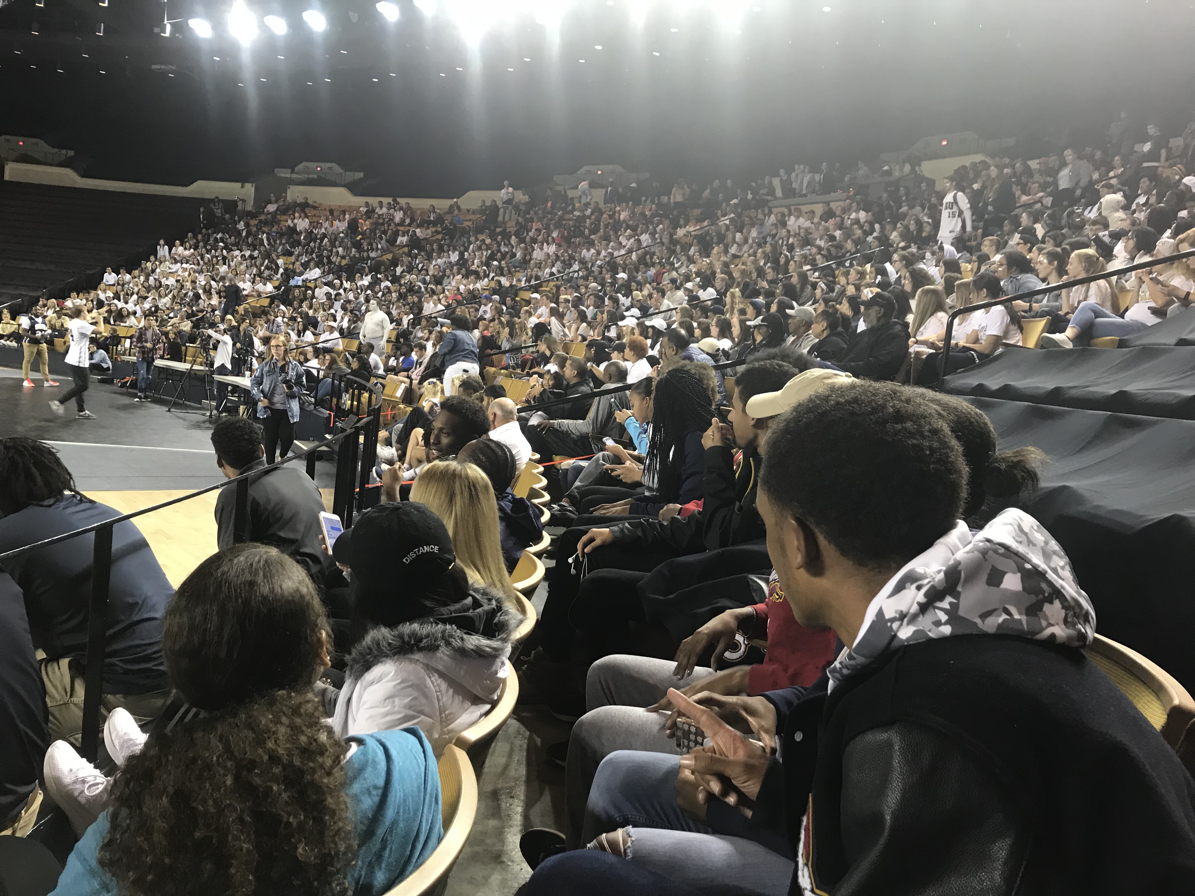
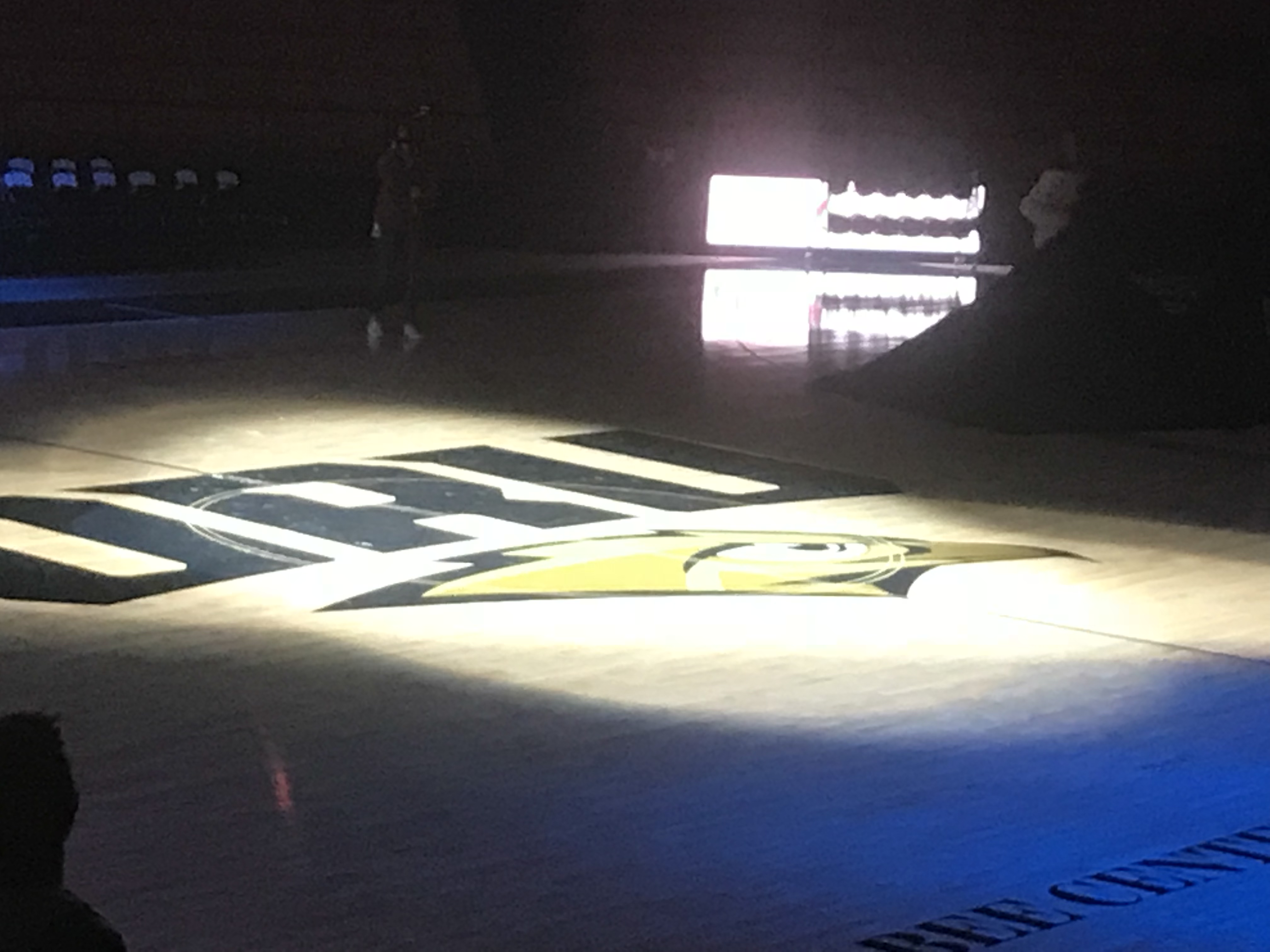
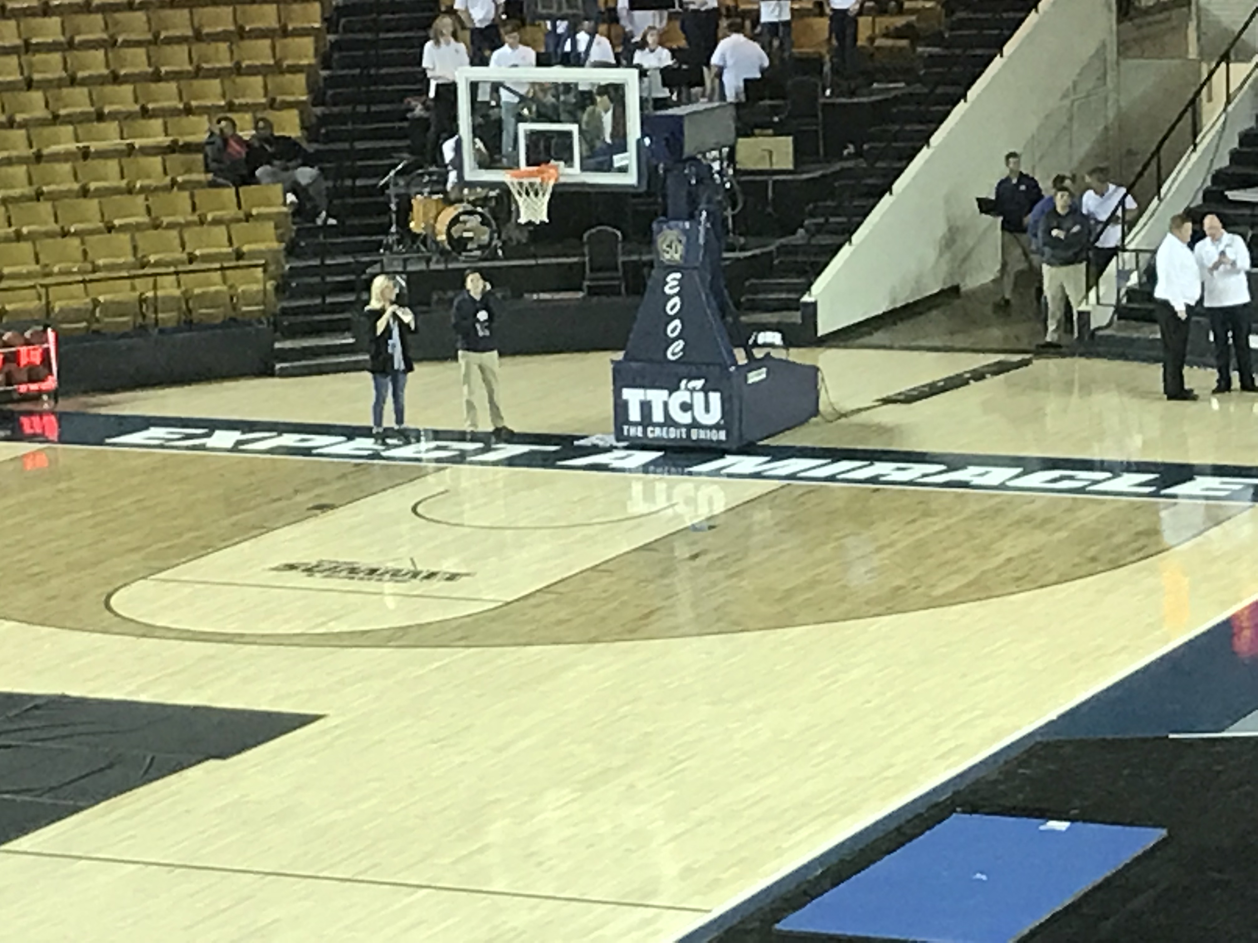
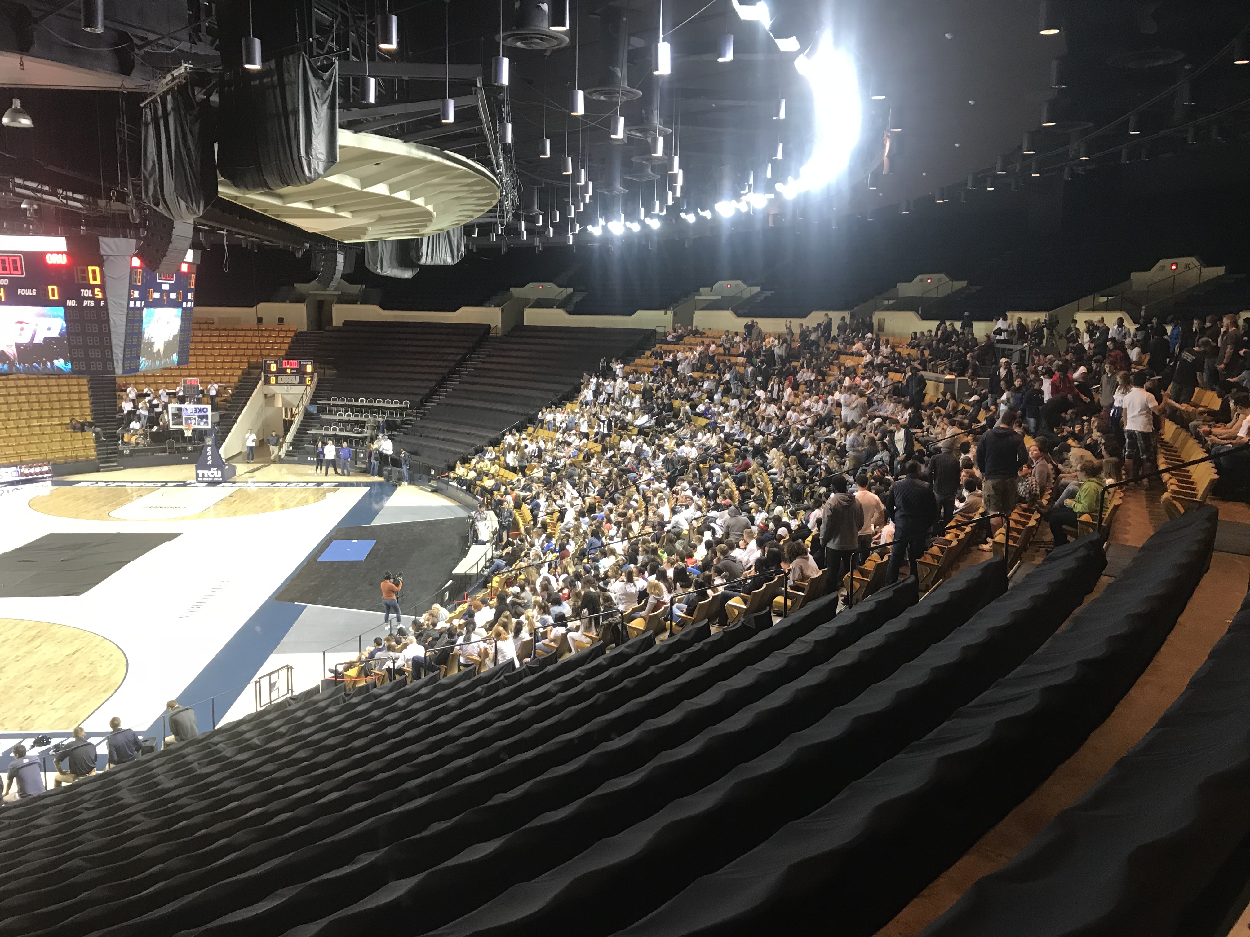
Not thrilled with the font, but it is a marked upgrade over the arched ORU. The bird is a HUGE improvement over Eli - and the replacement of the HUGE Eli on the court is a welcome change. At first blush, I like the staining of the key and three-point area, but I'll want to see it in person to gain a better perspective. I'm also VERY glad to see that the "Expect a Miracle" was maintained. I know that there was some conversation about deleting it from the court, but I'm pleased with the final outcome. To me, it is a reflection of the DNA of the University. Finally, I loved seeing the turnout from the students and local fans. Nice to see some excitement for ORU hoops!1 point
-
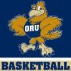
I like it. A lot. Our logo finally represents the fierce bird that the golden eagle is. It’s a huge upgrade on the old Eli. Not a big fan of the font they used for the ORU, but I can live with it. HUGE props to the athletic department for finally making this move. Going to be buying some new ORU gear ASAP.1 point
-
1 point
-
1 point
-
1 point